Have you ever noticed how brighter colors can uplift your mood while darker ones can make you feel overwhelmed? Color has an impact on our emotions, and it’s time to explore the science behind it. You deserve to know why certain colors influence your feelings and mood in various situations.
Let’s dive into The Psychology of Color and discover the hidden effects paint colors have on our emotional wellbeing.
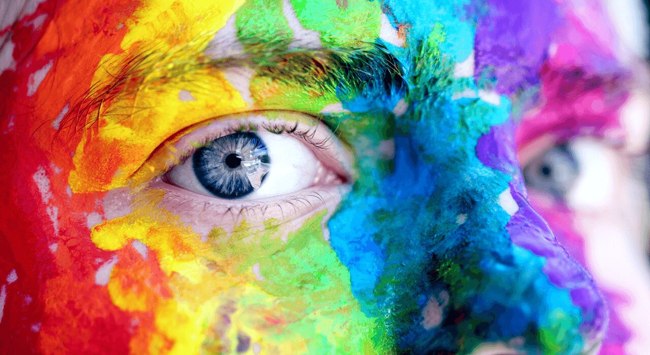
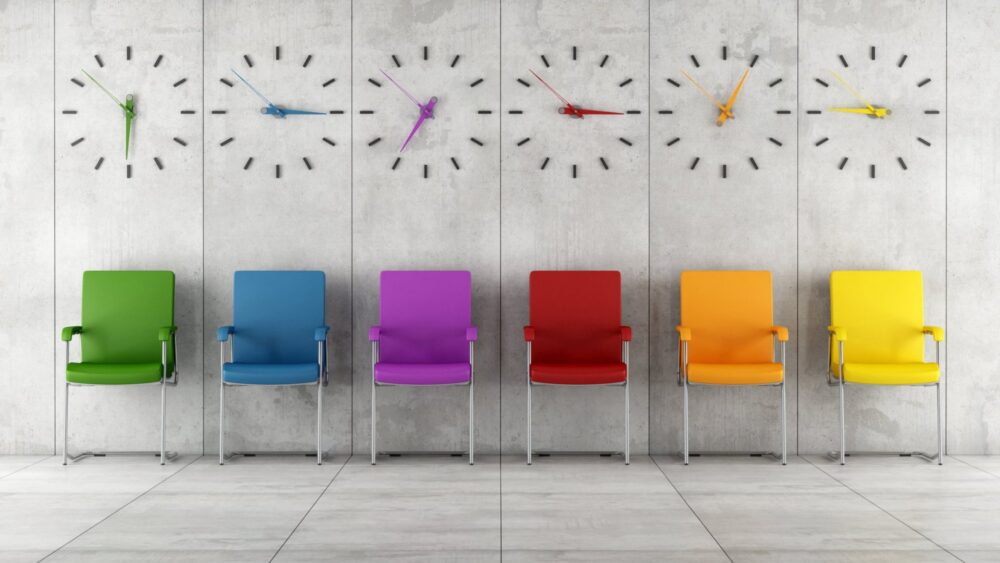
How Colors Affect Emotions
Source: piggyride.com
The psychological impact of color is an important aspect of interior design. Different colors have the power to evoke specific emotions in the people that see them, and these reactions are often associated with different meanings and feelings. It’s no wonder why firms like Coca Cola, McDonald’s and Google use specific shades of red; they recognize the importance of creating a mood or feeling when they craft their branding campaigns.
Interior design involves a range of considerations, such as furniture selection, lighting, and color, and it’s important to work with experts who can provide comprehensive guidance. That’s why many clients turn to firms such as Absolute Home Services, which offers a range of services including expert color consultation.
By understanding how they affect emotions, you can surround yourself with hues that are conducive to productivity and relaxation. For example, warm tones like red and yellow create feelings of energy, while cool blues and greens evoke a sense of calmness. Each one has many nuances, so exploring its entire range can help you find exactly what works for your living space. Here are examples for several popular shades:
- Red: Strength, courage & power
- Orange: Optimism & enthusiasm
- Yellow: Joy & happiness
- Green: Growth & balance
- Blue: Stability & trustworthiness
- Purple: Creativity & wisdom
- Gray/Neutral tones: Minimalism & complexity
Color Psychology in Interior Design
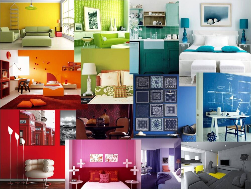
Source: pinterest.com
When you think of color psychology in regards to interior design, you may be surprised to learn that its effects go far beyond just aesthetics. Your choice of paint can have a direct impact on the mood and emotion of whoever has the pleasure of inhabiting that space.
Specifically, when we look at color psychology in interior design we can use primary colors such as red, blue and yellow; secondary ones such as orange, green and purple; and tertiary colors such as turquoise and salmon to convey a variety of messages. For example, red is often thought of as an energizing hue that can act as an appetite stimulant. Meanwhile blue is usually seen as calming while yellow is usually associated with cheerfulness and optimism. On the other hand, green is often used for relaxation while purple has been known to inspire creativity and peace. Finally, turquoise has been connected with youthfulness while salmon can be used to signify warmth or intimacy.
The Impact of Color on Productivity
Source: inc.com
The psychological properties of color can have a profound effect on how we think and act, making it a powerful tool for setting the right environment. Properly choosing paint colors is especially important in productive workspaces like offices. While there is no single scientific consensus on how different colors affect productivity, there are trends and themes that can help guide you to make the best decisions when selecting them for your office space.
In general, it’s best to pick ones that evoke feelings of energy and focus without being too stark or distracting. Warm shades of yellow, blue, and green are popular choices because they stimulate activity without being overstimulating. Darker shades of blue in particular have been shown to increase focus and promote feelings of contentment. Shades of yellow usually evoke feelings of optimism and creativity, while blues are generally calming and peaceful. Greens remind us of nature which can help employees reconnect with their work and promote productivity in the workplace. Warmer hues such as oranges or pinks should be used sparingly as they can appear energizing but also distract people from getting tasks done efficiently.
While you may want to express yourself creatively with brighter color choices such as reds or purples, these colors tend to be overpowering or stimulating in an office environment and may cause conflicting energies throughout the office space if used excessively. In general, subtle tones are typically more conducive to higher levels of productivity than intense hues because they support communication while also promoting comfort within a workspace.
The Impact of Color on Memory and Learning
Source: color-meanings.com
The use of it in a space can strongly influence an individual’s ability to focus and concentrate, as well as the degree of memorization. It can also have a significant impact on mood: lighter colors tend to stimulate and energize, while darker colors often have a calming effect. Studies have also shown that certain ones can help to improve academic performance.
Research at the University of Texas found that classrooms painted with deep blue or pure white color significantly improved students’ grades. Other studies have indicated that warmer – not necessarily brighter – tones like yellow, orange, or red might have a positive effect on cognitive activities such as decision-making. For example, looking at yellow can lead to increased feelings of enthusiasm and energy to tackle tasks, while blue is more conducive to creative work and concentration—the perfect set up for retaining knowledge better over multiple topics.
The impact of it on memory retention is also evident in how we remember information visually. For example, when studying for an exam, using brightly colored notecards might help more than simply writing out the information on standard white paper—blue cards can enhance focus and creativity while red cards are great for solving logical problems like math equations or memorizing facts related to history or literature classes. Together, these insights emphasize the effect of environmental design elements: if you want to review efficiently and be most successful with memory recall tasks (such as preparing for a test), it would behoove you to create an environment suited for your purpose!
Conclusions
When selecting paint or décor for your home, pay attention to what you are drawn to in terms of both function and aesthetics. Personally select color combinations that bring about positive feelings or memories in order to achieve satisfaction from your design choices over time. If needed, feel free to consult with specialists like interior designers who are experienced in using color effectively and tastefully through their design services.