Custom desk plate design can be a creative and enjoyable process. There are a lot of benefits that you get while getting your name customized on the plate. Custom nameplates for the desk and the wall are important things to have if you want to get recognition and want convenience. Some items give your job a slightly more official feel.
Some people adore having a personalized name tag as their official symbol, others adore having the option to modify their email signature, and still, others adore updating their LinkedIn status. But for some people, getting personalized nameplates for their desks or doors is the real deal-breaker. Further, this article will help you know more about the dos and don’ts of designing desk custom plates.
Source: memoriesmade.ca
Some Of The Do’s And Don’ts Of Designing Desk Custom Plates
It is important to know about the do’s and don’ts that are important for you to know about custom designs. If you are planning to get your custom name plates, you must reach out to trustworthy sources that can assure you of good quality plates. To ensure that your custom desk plates come out both visually appealing and professional, keep in mind the following dos and don’ts:
Dos:
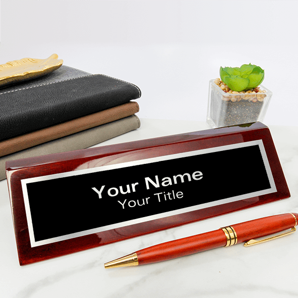
Keep It Simple
When it comes to desk plates, simplicity is key. Many people choose too much design and graphics, which should be avoided as simplicity attracts more people. A simple, uncluttered layout will be more aesthetically pleasing and simpler to read. Go for simple designs where the information can be seen properly and, at the same time, it can look presentable.
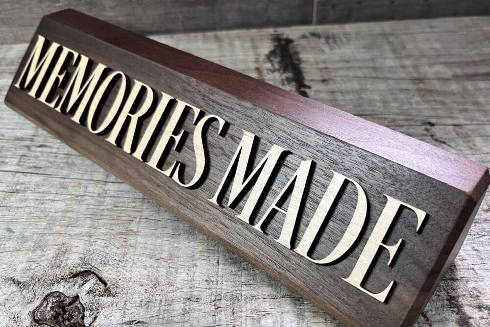
Think About Branding
Source: davesrusticdecor.com
This is considered one of the best ways of braiding if you plan to do extensive marketing for your business. If the desk plates are for a business or organization, make an effort to include the logo’s colors or other visual cues to maintain brand identity and consistency. You must try your best and make them appealing so that in one glance, a person can remember your plate, and with brand consistency, they will be able to remember your brand immediately. You can use this as a branding opportunity also.
Use Appropriate Spacing And Alignment
Make sure that all elements are placed and positioned correctly. The alignment, format and design play a huge role in making the plat look presentable. The appearance is more polished when spacing and alignment are consistent. A design preview should always be made before printing or ordering desk plates. Always check minute details, as you can’t make any other changes after printing. Make the necessary corrections after checking for any mistakes or formatting issues.
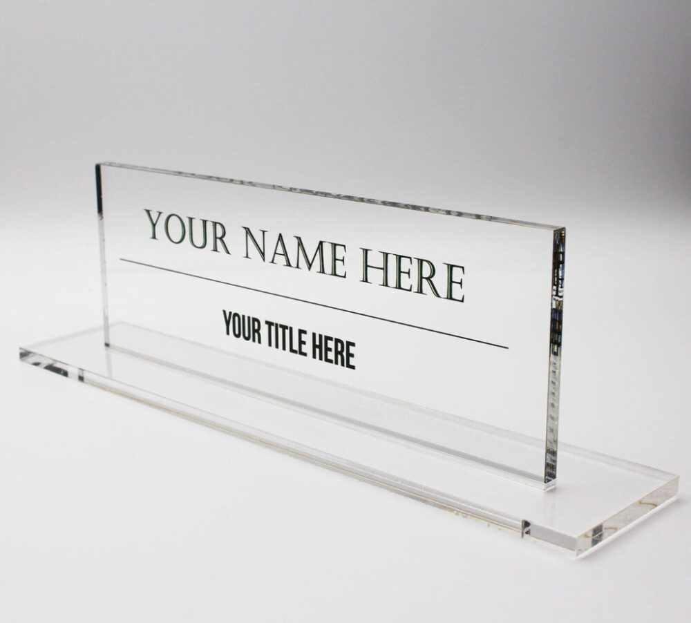
Select Readable Fonts

Source:www.vistaprint.com.au
Choose fonts that are simple to read. You should go for those fonts that, when seen in smaller areas, can be read easily and from afar. If you go for too stylish fonts or fonts that are too bold, then it is hard for the reader to catch the alphabet easily. Avoid using a script or overly decorative fonts that might be challenging to read quickly. You can make your plate look designer and readable just by making it simple.
Use High-Quality Graphics
To prevent pixelation or blurriness, if you include graphics or images on the desk plate, ensure they are of a high resolution and quality. Many people spend a limited amount on graphics, which usually results in high pixelation and makes everything look blurry. It should be avoided at any cost. If people need help to read the information properly, what is the use o having a custom plate?
Choose a source that can assure you that after the print is done on the plate, the information can be easily visible to the person reading it.
Don’ts:
Maintain Professionalism
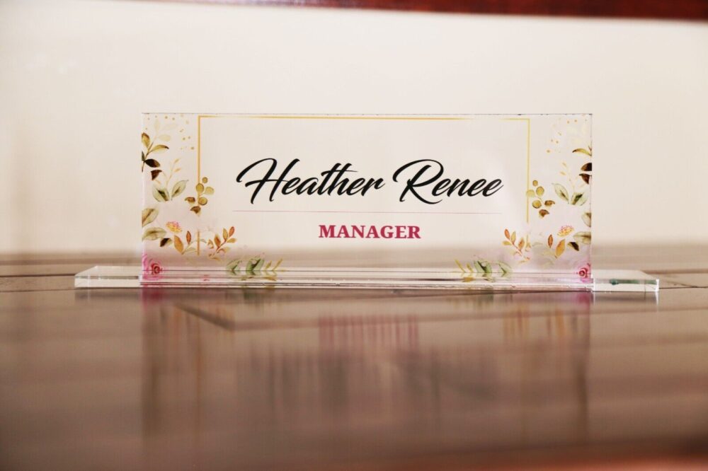
Source: davesrusticdecor.com
Even if you want to give the design some personality, remember that it should still project a sense of professionalism, particularly in a work environment. Remember that it will become your identity, and it should represent you in the best way possible but at the same time, it should be professional. While you’re getting your nameplate design, ensure this thing so that you will be able to get the best results.
Avoid Using Too Many Colors
Using too many colors can be overwhelming, even though branding is important. Choose any two colors as they are the minimum shades you need which will help you to achieve a beautiful design and, at the same time, look professional. Stick to a few complementary colors to maintain a unified and aesthetically pleasing design. Check out different designs on the web and ensure that the design should match the contemporary vibe. If you reach out to professional graphic designers, they will assure you to get the best design according to your taste.
Don’t Skip Proofreading
Spelling and grammar errors can make the desk plate appear less professional. This is one of the most general things that you need to get checked, and this should be right. Always check the text a second time for errors before completing the design. Even though plates do not have a lot of text, sometimes, while deciding on the designs, you might need to check the text, so don’t do that and proofread the text.
Avoid Clutter

Source: www.vistaprint.ca
Make sure to overcrowd the desk plate with enough information and more design elements. Many people need to correct the mistake of overloading the information, which makes the plate look not so appealing. It can make the plate look messy and difficult to read. You need to decide what information will be enough and expresses the information the best. You can get the help of a professional who will provide you with the best designs.
Bottom Line
All these dos and don’ts are important to consider if you want to get the best-designed custom plates for yourself. You can consider this as your guide and ensure that you can use the plate and make it attractive and, at the same time, readable for the viewer.